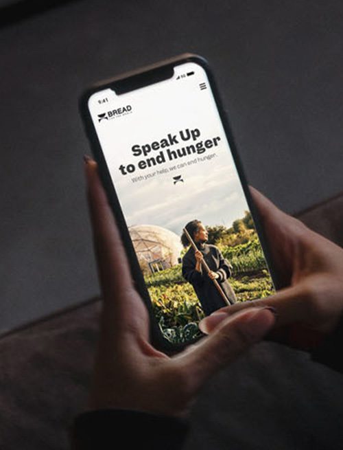
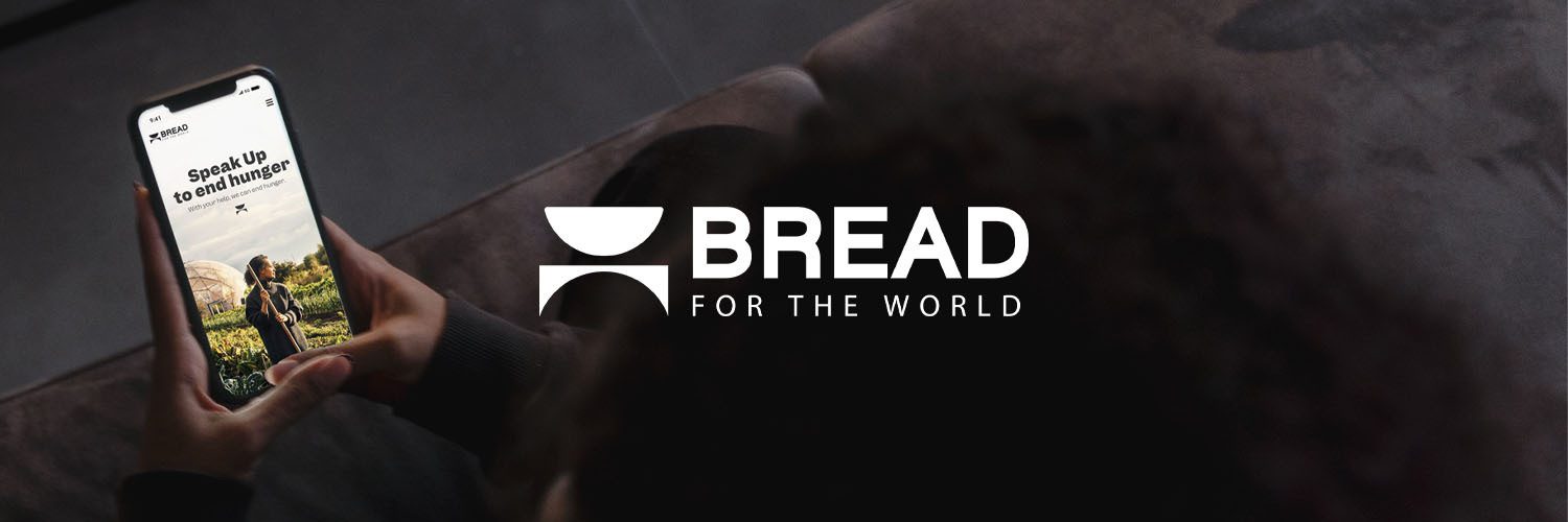
By now you may have noticed that Bread for the World got a new logo, a fresh coat of paint, and a brand-new website.
And as a small part of a big team that’s been working on this redesign for over a year, I can tell you that this project hasn’t been entered into lightly. In fact, the obsessive intentionality that has permeated every aspect of this redesign has been a true labor of love. By way of example, here’s a glimpse of what went into just one aspect of many, the logo.
As Bread President Rev. Eugene Cho recently shared in an email to all of us:
“The table represents Bread’s work in a powerful way. It invites us to consider if we’re making room at our table for those who are hungry. It reminds us that we sit and invite others to join us at tables of power and influence with lawmakers who wield tremendous responsibility. And most importantly, it evokes the many times that Jesus used a table to teach, correct, mourn, show compassion, and feed people experiencing hunger…And feeding people is why there’s a bowl. When we look at the bowl, do we see it as empty or full? Do we own that bowl as our charge to do all we can to make sure that no person, in any corner of the world, goes to bed hungry?”
The selection of a bowl and table is perhaps the most striking update – and discovering this logo was no small task. For months, we talked about Bread, what we do, and what matters most. We talked about our faith, what we’d tell a stranger about our work, and what story a logo needs to tell.
We saw many logos, revised them, and finally decided on a beautiful, modern logo with a small leaf that represented growth, progress, and agriculture. Then, we threw it away.
After prayer and deliberation, there was a check in the collective spirit of the group that this didn’t represent you the way it should. So, we started over. And in that process the bowl and table came into focus.
Yet even then, we saw a dozen variations of bowls and tables to find the one that would be worthy of Bread’s story today and hold up over time. And to belabor the point, once we saw the almost-final bowl and table logo that you have before you today, we adjusted the size, the distance between the bowl and table, and the font that sits next to the logo.
In short, we obsessed.
And that’s just a quick overview of what went into the logo. We also did this with the colors, website functionality, website design, verbiage, and social media. It has been a year of wallowing in the joyful minutia to create a final, cohesive, representation of Bread for the World – for you.
Without you, this logo would be nothing more than a fancy new design. But because of you, it becomes a beacon of hope that there are deeply passionate people who are coming to the table, making sure the bowls are filled, and committed to ending hunger.
Thank you for your deep commitment to all that Bread for the World represents.
Eddie Kaufholz is director of strategic communications and campaigns at Bread for the World.
Related Resources

Pray for Elected Leaders
Prices are on the rise, and this is having a devastating impact on families who are trying to...

Finding Your Corner in the Sky
“Everything has its season; everything has its time …. Show me a reason, and I’ll soon show you...